


Introduction
Website accessibility means building a website that everyone can use, including people who are blind, have low vision, are deaf or hard of hearing, have limited mobility, or have cognitive differences. It also helps people in everyday situations, such as reading a site on a bright screen, using a slow mobile connection, or filling in a form with one hand.
For Indian businesses, accessibility is a customer issue, not a technical extra. If a visitor cannot read your prices because the text contrast is too low, cannot submit your enquiry form because the labels are missing, or cannot follow your video because there are no captions, that visitor leaves. They rarely explain why. They simply choose a competitor whose site works for them.
This guide explains accessibility in plain language: the four WCAG principles, the Indian context (RPwD Act 2016, IS 17802, GIGW), and a practical fix order for an existing site. It is general guidance, not legal advice
WCAG principles in plain language
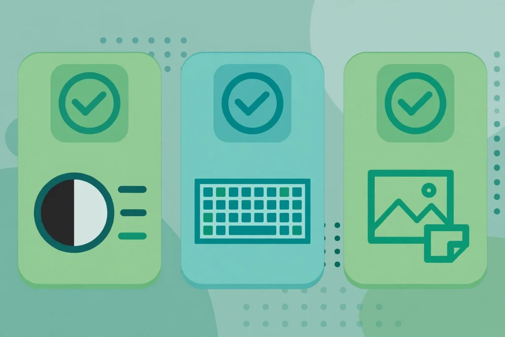
The Web Content Accessibility Guidelines (WCAG) are organised around four principles, remembered by the letters POUR: perceivable, operable, understandable, and robust. If you understand these four ideas, most fixes will make sense.
Perceivable: can users see and hear the content?
Perceivable means information must be available to the senses. Text needs enough contrast against its background. Images that carry meaning need alt text, so a screen reader can announce what they show. Videos need captions, and audio needs a transcript where practical. Content must not rely on colour alone.
Operable: can users navigate and use the site?
Operable means users can operate the interface. Every menu, button, form, and popup should work with a keyboard alone, not only with a mouse. There should be a visible focus indicator so keyboard users can see where they are, and navigation should stay consistent across pages.
Understandable: can users read and follow the content?
Understandable means text is readable and the interface behaves predictably. Pages should use clear language and labels that explain what each field is for. Error messages should say what went wrong and how to fix it.
Robust: does the site work with assistive technology?
Robust means the site is built so assistive technologies can interpret it reliably. This depends on clean code and proper use of headings, lists, landmarks, and form labels. A heading structure that jumps from H1 to H4 may look fine visually but confuse a screen reader.
Most work aims for WCAG Level AA, the widely used middle level. Level A covers the most basic barriers, Level AA addresses the major barriers most users face, and Level AAA is the strictest level and is not usually required for a whole site.
The India context: RPwD Act, IS 17802, and GIGW
The Rights of Persons with Disabilities Act 2016 (RPwD Act) is India’s principal disability rights law. It recognises the rights of persons with disabilities and includes duties relating to accessibility in public life, services, and information. While its strongest obligations fall on government and public bodies, its direction is clear: digital services should be usable by people with disabilities.
IS 17802 is the Indian standard for web accessibility, and it aligns with WCAG 2.1 Level AA. This is helpful for businesses: if your site meets WCAG 2.1 Level AA, you are broadly aligned with the Indian standard’s technical expectations, and you do not need to learn a completely separate rulebook.
GIGW, the Guidelines for Indian Government Websites, applies to government websites in India. Private businesses are not directly governed by GIGW, but it matters if you build or maintain a site for a government client, where GIGW expectations may apply. For a private business site, WCAG 2.1 Level AA remains the practical target.
A prioritised fix order for an existing site
Many guides list dozens of issues with no order. For an existing WordPress or business site, work in this order, starting with the largest barriers.
- Fix headings and page structure. Every page should have one H1 describing the page topic, followed by H2 and H3 headings in logical order. Do not use headings only to make text large, and do not skip levels.
- Add meaningful alt text to images. Decorative images should have empty alt text so screen readers skip them. Informative images need a short description of what they show. Infographics need a text summary on the page.
- Fix text contrast and font size. Body text should contrast strongly with its background. Check buttons, footer text, and placeholder text too, since these are often the lowest contrast areas.
- Make the site fully keyboard accessible. Try using your site with the Tab, Enter, and arrow keys only. You should reach every menu item, button, form field, and popup, and always see where the focus is. Fix any keyboard traps, where a user can enter a menu but cannot tab out.
- Fix forms and labels. Every field needs a visible, correctly associated label. Placeholder text alone is not a label, because it disappears when the user starts typing. Error messages should explain the problem and suggest a fix.
- Fix media: captions, transcripts, and audio. Add captions to videos, provide transcripts for important audio and video content, and ensure media players have accessible controls. If a video autoplays, give users a clear way to pause or stop it.
- Fix navigation, links, and documents. Link text should describe its destination, so avoid links that only say “click here” with no context. Keep navigation consistent, and check downloadable PDFs, which often carry the same barriers as web pages.
Start with your homepage, your most visited service pages, and your contact page. A partially accessible site covering its most important pages beats a perfect plan that never ships. A regular website maintenance plan helps, because accessibility checks can sit alongside updates, backups, and broken link checks.
Mobile and regional language issues in India
India’s web is overwhelmingly mobile, so phone accessibility deserves its own attention. Touch targets should be large enough to tap reliably, with enough space between buttons and links. Text should be readable without pinching and zooming, and popups should not cover the main content or trap keyboard focus.
Heavy pages and autoplaying video also make a site harder to use on a slower connection or an older phone. Optimising images and keeping pages fast is an accessibility improvement too, and a fast mobile first website approach covers many of the same fixes.
Regional languages add another layer. If your site publishes in Hindi, Tamil, Bengali, Marathi, or other Indian languages, declare the language of each page or section in the code, so screen readers pronounce it correctly. Keep the same heading, label, and alt text standards in translated content as in English, and make the language switcher keyboard accessible.
Free and paid testing tools, and how to use them
You do not need expensive tools to start. A combination of free checks and manual testing will cover most businesses.
- WAVE: a browser extension that highlights errors, contrast problems, and structural issues directly on the page. Use it page by page, treating its report as a starting point, not a final verdict.
- axe DevTools: a browser extension that runs automated checks and explains each issue with guidance on how to fix it. It is popular with developers because it fits into everyday browser testing.
- Lighthouse accessibility audit: built into Chrome DevTools, it gives a quick score and a list of issues. Useful for a fast first pass, but it catches only a portion of real barriers, so never rely on the score alone.
- NVDA and VoiceOver: free screen readers (NVDA on Windows, VoiceOver on Mac and iPhone) that let you hear how your site sounds to a screen reader user. A short test of your homepage and enquiry form will reveal problems automated tools miss.
- Keyboard testing: no tool needed. Navigate with the keyboard only, and note every place where focus disappears, a menu cannot be reached, or an action cannot be completed.
Paid tools add site-wide scanning and monitoring for large sites, but automated tools still catch only a portion of issues, so manual keyboard and screen reader testing remains essential.

A simple audit routine you can repeat every quarter
Accessibility is maintenance, not a single project. Each quarter, choose a sample: your homepage, your top three service pages, your contact page, and one blog post. Run an automated check on each, then a manual keyboard and screen reader pass. Fix the highest impact items first, and re-test before marking them done.
Then check what changed since the last audit. New plugins, templates, forms, and media are the usual sources of regressions. If you are planning a redesign, build accessibility checks in from the start. A website redesign checklist that includes accessibility will save rework later. Finally, publish a short accessibility statement stating your target standard, such as WCAG 2.1 Level AA, and a contact method for users who hit a barrier.
Frequently asked questions
What is the difference between WCAG and IS 17802?
WCAG is the international Web Content Accessibility Guidelines. IS 17802 is the Indian standard that aligns with WCAG 2.1 Level AA, so working to WCAG 2.1 Level AA is how most Indian businesses align with IS 17802.
Do small business websites really need to be accessible?
Yes, in the sense that every business website should be usable by its customers. A small site with a homepage, a few service pages, and a contact form can achieve a great deal with the basics in this guide: headings, alt text, contrast, keyboard access, and labelled forms. The cost is modest, and the benefit is a site more customers can actually use.
Is an accessibility overlay or widget enough?
No, not on its own. Overlays can add some helpful features, but they do not fix missing labels, poor heading structure, or inaccessible forms, and they can interfere with assistive technology a user already relies on. Fix the site itself first.
How long does it take to make an existing site accessible?
It depends on the size of the site and how many templates it uses. A small WordPress site can see major improvements in a few weeks by fixing templates, headings, forms, and its most visited pages. A large site should be tackled in phases: templates and high traffic pages first, then remaining content over following quarters.
Conclusion
Website accessibility for Indian businesses comes down to a straightforward commitment: build pages that everyone can perceive, operate, understand, and use with the technology they rely on. Start with WCAG 2.1 Level AA, understand how it aligns with IS 17802, and work through the prioritised fix order, headings, alt text, contrast, keyboard access, forms, and media.
Pay special attention to mobile use and regional language content, because that is how much of India actually experiences the web. Test with free tools, your keyboard, and a screen reader, and repeat a short audit every quarter.

1 Comment
Pingback: UI UX Design for Indian Websites: A Practical 2026 Guide